
Brand Book


Měníme návyky,
měníme firmy
Digitalizace je jen začátek,
skutečná změna přichází s lidmi
.svg)
Dáváme smysl digitalizaci.
Nejde nám o technologie pro technologie. Chceme, aby lidem v práci dávaly věci větší smysl, šetřily čas a energii, a přitom byly moderní, funkční a přívětivé. Pomáháme firmám růst tím, že jim pomáháme zjednodušit a vylepšit to, co dělajíkaždý den.
Chceme být těmi, kdo firmám pomáhají z chaosu do klidu.
Když to vypadá, že už se v procesech nedá vyznat, jsme ti, kdo s chladnou hlavou, dobrými otázkami a špetkou drzosti pomůžou vše narovnat.
Věříme, že když se zkrotí opakující se rutina, otevře se prostor pro skutečnou práci, nápady a rozvoj. A právě to je budoucnost, kterou chceme tvořit.
S digitalizací měníme procesy. Se změnou přístupu měníme firmy.
Tahle věta vystihuje náš přístup: technologie nejsou cílem, ale prostředkem. Důležité je, jak je použijeme, jak se na ně dívá vedení firmy, a jak je přijmou lidé, kteří s nimi každý den pracují.
Nejsme jen dodavatel, jsme partner
Máme zkušenosti z velkých firem, zvládáme komplexní digitalizační projekty a nabízíme end-to-end řešení. Ale hlavně, když něco nefunguje, řekneme to. Když je potřeba klienta trochu vyprovokovat, uděláme to. Protože víme, že skutečná změna přichází až tehdy, kdy se někdo odváží říct: „Takhle už ne. Zkusme to jinak.“
Naši klienti jsou nejčastěji:
manažeři digitalizace, provozu, IT nebo inovací, ředitelé firem a lídři týmů, kteří chtějí modernizovat fungování firmy
Zaneprázdnění, zahlcení a hledají pomocníka, který je provede změnou
Opatrní, digitalizace pro ně může být riziko, investice, ale i příležitost
Zvyklí, že „dodavatelé“ moc neříkají ne (a o to víc si váží toho, že my ano, když to dává smysl)
1. Otevřenost a lidskost
U nás platí: když něco nedává smysl, řekni to. Jsme lidi, se kterými je radost pracovat, jsme normální, přímí a fajn. Věci si říkáme na rovinu, mezi sebou i s klienty. Spolupráce s námi je příjemná, ale zároveň věcná.
2. Zvídavost a odvaha hledat nové cesty
Nebojíme se ptát „Proč?“ a „Co kdyby?“. Rádi zkoumáme, vrtáme se v problémech a hledáme, jak to udělat lépe. Nehledáme výmluvy, ale řešení.
3. Ambice a odpovědnost
Chceme růst, jako tým i jako jednotlivci. A rosteme i tak, že věci dotahujeme do konce. Když něco slíbíme, uděláme to. Věříme, že tah na branku a zodpovědnost jdou ruku v ruce.
4. Partnerství a výzva
Nejsme "hodní dodavatelé". Jsme rovnocenná protistrana, partner, který se nebojí oponovat. Klienty challengeujeme, protože věříme, že jen tak vznikají smysluplná řešení.
5. Expertíza a poctivost
Máme výsledky, zkušenosti i know-how. Víme, co děláme, a víme, proč to děláme.Umíme proměnit vize ve funkční realitu. Nepatříme k nejlevnějším, protožepřinášíme skutečnou hodnotu jinak.
Komunikace INFOMATIC je čitelná, lidská a důvěryhodná.
Mluvíme tak, aby nám klienti i partneři rozuměli, cítili se s námi dobře a zároveň vnímali naši odbornost a jistotu v tom, co děláme.
Srozumitelně
Používáme běžný jazyk, ne přehnaný odborný žargon. Složité věci umíme vysvětlit jednoduše i to je součást naší expertízy.
Odborně a věcně
Fakta mají hlavní slovo. Víme, co děláme. A to, co říkáme má hlavu a patu, ale bez zbytečné okázalosti.
Přirozeně lidsky
Komunikujeme s respektem a empatií. Nesnažíme se být přehnaně vtipní nebo cool, stačí být opravdoví a vstřícní.
Strukturovaně, ale dynamicky
Dáváme věcem řád, aby se v nich dalo vyznat. Zároveň se nebojíme přirozeného tempa, příkladů nebo metafor, které věci oživí.
Sebevědomě, ale ne arogantně
Máme zkušenosti a umíme za nimi stát. Neprodáváme vzdušné zámky. Když něco nevíme nebo nedoporučujeme, říkáme to na rovinu.
Vykání nebo tykání?
Klientům a partnerům povětšinou vykáme a komunikujeme s respektem, ale přirozeně.
V komunikaci značky vykáme nebo mluvíme v množném čísle („Pomůžeme vám...“, „Zjednodušíme vaše procesy...“). Tykání do veřejné komunikace nepatří.
Jací jsme navenek?
Profesionální
Rozumíme tomu, co děláme a je to na nás vidět i slyšet. Nehrajeme si na experty, jsme experti. Dodáváme řešení, za kterými si stojíme. Když něco doporučíme, máme pro to dobrý důvod.
Inovativní
Technologie pro nás nejsou cíl, ale nástroj, jak dělat věci lépe. Hledáme nové cesty a nebojíme se přemýšlet jinak, zkoušet a testovat. Jsme zvídaví a baví nás posouvat hranice, ať už svoje, nebo klientských projektů.
Lidští a přátelští
Jsme normální lidé, přímí, otevření a vstřícní. Je s námi radost spolupracovat umíme se smát, ale umíme i říct ne, když je to potřeba. Spolupráce s námi je o partnerství, respektu a férovém přístupu.
Inspirativní
Pomáháme vidět budoucnost v lepším světle. Ukazujeme firmám, že změna dává smysl a digitalizace není strašák, ale příležitost. Že rutinu můžou nechat na technologiích a věnovat se práci, která je baví a má vyšší hodnotu pro jejich podnikání.
Proč pracovat s námi?
Šetříme lidem čas i peníze tím, že zjednodušujeme jejich každodenní práci.
Neřešíme jen procesy, řešíme i změnu přístupu.
Technologie přizpůsobujeme lidem, ne naopak.
Umíme to s komplexitou i výzvami a dotahujeme věci do konce.
Proč na tom záleží?
Hodnoty, mise, vize i tón komunikace nejsou jen slova do šuplíku nebo do prezentace pro klienta. Jsou to základní věci, podle kterých se rozhodujeme, jak děláme věci, a hlavně proč je děláme tak, jak je děláme.
Pomáhají nám táhnout za jeden provaz, i když máme různé role, někdo programuje, jiný jezdí ke klientům nebo řeší byznys. Díky tomu máme společný jazyk a víme, co od sebe navzájem čekat.
Když víme, kam směřujeme a co je pro nás důležité, můžeme dělat lepší rozhodnutí. Rychleji, efektivněji, a hlavně s tím, že to dává smysl nejen klientům, ale i nám samotným.
Není to dogma. Je to kompas.
Co to znamená v praxi?
Obchodník ví, že nejde o to „prodat za každou cenu“, ale nabídnout řešení, které klientovi fakt pomůže. A klidně si s ním sednout a probrat, že někdy je cesta jiná, než si myslel.
Technik má jistotu, že když řekne „tohle není dlouhodobě dobré řešení“, nikdo ho neshodí ze stolu. Respektujeme jeho zkušenosti a dáváme mu prostor se ozvat.
Vývojář chápe, že nemá kódovat jen aby to běželo, ale tak, aby řešení bylo
udržitelné, smysluplné a odpovídalo reálným potřebám. A když se vynoří problém, je v bezpečném prostředí k tomu ho řešit, ne ho maskovat.
Jak naše hodnoty, mise, vize a tone of voice používat?
Nejsou to pravidla vytesaná do kamene, ale spíš kompas, který nám pomáhá rozhodovat se v práci i v komunikaci s klienty nebo mezi sebou.
Kdy se hodí si na ně vzpomenout:
Když si nejsi jistý, co je správný postup
Zeptej se: „Dává to klientovi smysl? Je to v souladu s tím, co chceme dělat jako firma?“ Pokud ne, možná je čas to probrat s týmem nebo zkusit jiný přístup.
Když komunikuješ s klientem
Buď otevřený, zvídavý, férový. Klienti často ocení víc náš přístup než samotné řešení, a to dělá rozdíl.
Když se něco nedaří
U nás je normální říct „Hele, tady to skřípe.“ Nejde o hledání viníka, ale o hledání lepší cesty. Chyby nejsou ostuda, jsou šance něco vylepšit.
Když spolupracuješ napříč týmy
Každý má jiný pohled a jinou odbornost. Když se budeme vzájemně respektovat a opravdu si naslouchat, dostaneme se dál než každý sám.
Když přemýšlíš, co dál
Chceš se učit nové věci? Posouvat se? Super! Jsme rádi, když lidi rostou s firmou. Když víš, kam směřujeme, můžeš si v tom najít vlastní cestu.
Neutral (Biscay Coral)
White
#ffffff
Neutral lightest
#e7ebef
Neutral Lighter
#d0d7df
Neutral Light
#5c738f
Neutral
#173760
Neutral Dark
#122c4c
Neutral Darker
#091626
Neutral Darkest
#06101c
Primary (Science Blue)
Primary lightest
#e5f0fa
Primary Lighter
#cce2f6
Primary Light
#4c9be0
Primary
#0071d4
Primary Dark
#005aa9
Primary Darker
#002d54
Primary Darkest
#00213f
Secondary (Koromiko)
Secondary lightest
#fff8ee
Secondary Lighter
#fff1dd
Secondary Light
#ffd08a
Secondary
#ffbd59
Secondary Dark
#cc9747
Secondary Darker
#664b23
Secondary Darkest
#4c381a
Scheme 1
Text color
Scheme 2
Text color
Scheme 3
Text color
Scheme 4
Text color
Scheme 5
Text color
Tabler Icon set
Copy and use from this library https://icons.relume.io/collection/tabler .
Use this color:
Primary
#0071d4
HTML tags define default Heading styles.
Heading 1
Font: Barlow
Weight: 700 (Bold)
Size: 3.052 REM (48px)
Height: 120%
Heading 2
Font: Barlow
Weight: 700 (Bold)
Size: 2.441 REM (39px)
Height: 120%
Heading 3
Font: Barlow
Weight: 700 (Bold)
Size: 1.953 REM (31px)
Height: 120%
Heading 4
Font: Barlow
Weight: 700 (Bold)
Size: 1.563 REM (25px)
Height: 130%
Heading 5
Font: Barlow
Weight: 700 (Bold)
Size: 1.25 REM (20px)
Height: 130%
Heading 6
Font: Barlow
Weight: 700 (Bold)
Size: 1.125 REM (18px)
Height: 140%
Heading classes when typography style doesn't match the default HTML tag.
Heading-style-h1
Font: Barlow
Weight: 700 (Bold)
Size: 3.052 REM (48px)
Height: 120%
Heading-style-h2
Font: Barlow
Weight: 700 (Bold)
Size: 2.441 REM (39px)
Height: 120%
Heading-style-h3
Font: Barlow
Weight: 700 (Bold)
Size: 1.953 REM (31px)
Height: 120%
Heading-style-h4
Font: Barlow
Weight: 700 (Bold)
Size: 1.563 REM (25px)
Height: 130%
Heading-style-h5
Font: Barlow
Weight: 700 (Bold)
Size: 1.25 REM (20px)
Height: 130%
Heading-style-h6
Font: Barlow
Weight: 700 (Bold)
Size: 1.125 REM (18px)
Height: 140%
HTML tags define default text styles.
Lorem ipsum dolor sit amet, consectetur adipiscing elit. Suspendisse varius enim in eros elementum tristique. Duis cursus, mi quis viverra ornare, eros dolor interdum nulla, ut commodo diam libero vitae erat. Aenean faucibus nibh et justo cursus id rutrum lorem imperdiet. Nunc ut sem vitae risus tristique posuere.
Font: Barlow
Weight: 400 (Normal)
Size: 1.1 REM (18px)
Height: 1.5 REM (24px)
Block Quote
Font: Barlow
Weight: 400 (Normal)
Size: 1.25 REM (20px)
Height: 1.5 REM (24px)
No bullet list
No bullet list
Font: Barlow
Weight: 400 (Normal)
Size: 1.1 REM (18px)
Height: 1.5 REM (24px)
No bullet list
No bullet list
Font: Barlow
Weight: 400 (Normal)
Size: 1.1 REM (18px)
Height: 1.5 REM (24px)
No bullet list
No bullet list
No bullet list
Font: Barlow
Weight: 400 (Normal)
Size: 1.1 REM (18px)
Height: 1.5 REM (24px)
Text sizes classes when typography size doesn't match the default HTML tag.
Lorem ipsum dolor sit amet, consectetur adipiscing elit. Suspendisse varius enim in eros elementum tristique. Duis cursus, mi quis viverra ornare, eros dolor interdum nulla, ut commodo diam libero vitae erat. Aenean faucibus nibh et justo cursus id rutrum lorem imperdiet. Nunc ut sem vitae risus tristique posuere.
Font: Barlow
Weight: 400 (Normal)
Size: 1.625 REM (26px)
Height: 1.5 REM (24px)
Lorem ipsum dolor sit amet, consectetur adipiscing elit. Suspendisse varius enim in eros elementum tristique. Duis cursus, mi quis viverra ornare, eros dolor interdum nulla, ut commodo diam libero vitae erat. Aenean faucibus nibh et justo cursus id rutrum lorem imperdiet. Nunc ut sem vitae risus tristique posuere.
Font: Barlow
Weight: 400 (Normal)
Size: 1.25 REM (20px)
Height: 1.5 REM (24px)
Lorem ipsum dolor sit amet, consectetur adipiscing elit. Suspendisse varius enim in eros elementum tristique. Duis cursus, mi quis viverra ornare, eros dolor interdum nulla, ut commodo diam libero vitae erat. Aenean faucibus nibh et justo cursus id rutrum lorem imperdiet. Nunc ut sem vitae risus tristique posuere.
Font: Barlow
Weight: 400 (Normal)
Size: 1.125 REM (18px)
Height: 1.5 REM (24px)
Lorem ipsum dolor sit amet, consectetur adipiscing elit. Suspendisse varius enim in eros elementum tristique. Duis cursus, mi quis viverra ornare, eros dolor interdum nulla, ut commodo diam libero vitae erat. Aenean faucibus nibh et justo cursus id rutrum lorem imperdiet. Nunc ut sem vitae risus tristique posuere.
Font: Barlow
Weight: 400 (Normal)
Size: 1 REM (16px)
Height: 1.5 REM (24px)
Lorem ipsum dolor sit amet, consectetur adipiscing elit. Suspendisse varius enim in eros elementum tristique. Duis cursus, mi quis viverra ornare, eros dolor interdum nulla, ut commodo diam libero vitae erat. Aenean faucibus nibh et justo cursus id rutrum lorem imperdiet. Nunc ut sem vitae risus tristique posuere.
Font: Barlow
Weight: 400 (Normal)
Size: 0.75, REM (12px)
Height: 1.5 REM (24px)
Text weight classes when typography weight doesn't match the default HTML tag.
Text style classes when typography style doesn't match the default HTML tag.
Text alignment classes when typography alignment doesn't match the default HTML tag.
Heading 1
Heading 2
Heading 3
Heading 4
Heading 5
Heading 6
This is a block quote
The rich text element allows you to create and format headings, paragraphs, blockquotes, images, and video all in one place instead of having to add and format them individually. Just double-click and easily create content.
This is a link inside of a rich text
- List item
- List item
- List item
- List item
- List item
- List item

Logo ke stažení
Logo



Jaký formát mám použít?
Ve staženém balíčku najdete soubory s příponou .AI, .PNG a .SVG.
Pro všechna digitální zobrazení doporučujeme použít formát .SVG, jelikož je bezztrátový a oproti .PNG se dá zvětšovat jakkoliv potřebujete.
Ve staženém balíčku najdete soubory s příponou .AI, .PDF a .EPS.Pro běžné použití doporučujeme logo v křivkách ve formátu .PDF, pokud máte přístup k grafickým programům, použijte .AI a nebo .EPS.

Ochranná zóna loga
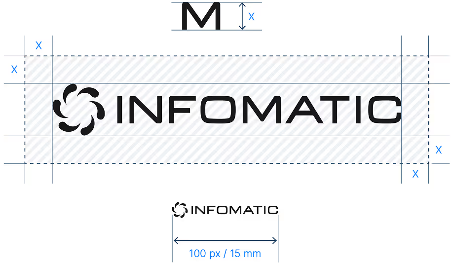
Proč ji dodržovat?
Použití loga




Vizuální styl



.png)
.png)

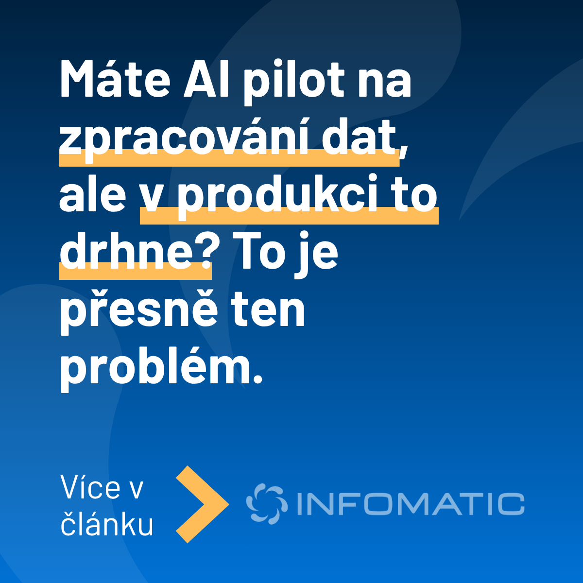
Použití fotek

Dobrý příklad
Přirozené výrazy, formální ale přátelské.

Špatný příklad
Nepřirozené výrazy, pohled do kamery, korporátní vzhled.

Dobrý příklad
Přirozené prostředí, autentické.

Špatný příklad
Aranžované, póza na kameru, přesvětlené.

Dobrý příklad
Zaměření na detail, jasně vidíme, co se děje a kam má jít pozornost.
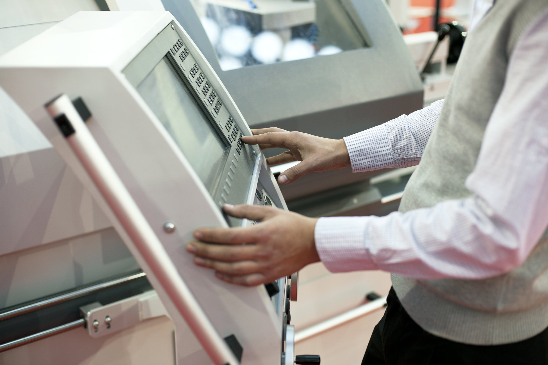
Špatný příklad
Nepřehledné, rušivé pozadí, není hned zřetelné co se na fotce nachází.
Linkable labels that categorize or highlight information on cards, products and posts
icon-height-xxsmall

icon-height-xsmall
icon-height-small

icon-height-medium
icon-height-large
icon-height-xlarge
icon-height-custom1
icon-1x1-xxsmall
icon-1x1-xsmall
icon-1x1-small
icon-1x1-medium
icon-1x1-large
icon-1x1-xlarge
icon-1x1-custom1
HTML embed icons enable you to control icon color on hover.
icon-embed-xxsmall
icon-embed-xsmall
icon-embed-small
icon-embed-medium
icon-embed-large
icon-embed-xlarge
icon-embed-custom1
Large radius is applied to elements which are 1 or 2 columns in width.
Medium radius is applied to elements which are between 2 and 3 columns in width.
Small radius is applied to elements which are smaller than 4 columns in width.
Shadows allow you to add depth and realism to designs by positioning elements on a z-axis.